
MOSA has Updated Our Logo!
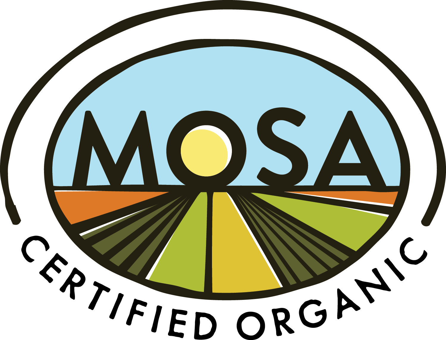
You may have noticed that the newsletter and the pictures of the new website feature a brand new MOSA logo. At the same time we decided to upgrade our website, we decided to also update our logo. While we liked the color and look of the old logo, we also recognized that it had some issues that needed to be addressed. The biggest of these issues was that the words “certified organic” underneath our name become difficult to read when the logo is printed at the smaller sizes that clients use on their product labels. In addition, the blocky lettering was too heavy, and the colors a little too bright.
We considered a completely new design, but ultimately decided to “evolve” the logo rather than completely change it. This way, consumers and clients will still recognize it as the MOSA logo, but with an emphasis on “certified organic,” which is the most important label claim on your packaging. The darkened colors and simplified graphics should also work better with label designs and color schemes.
We also recognized the need to improve the print quality of the logo, so instead of JPG files, the logo is now available on our website as a high definition PNG file. To accommodate different software and graphic design programs, we also have it available in EPS, AI, and PDF formats. Email or call us if you need one of these specialized formats.
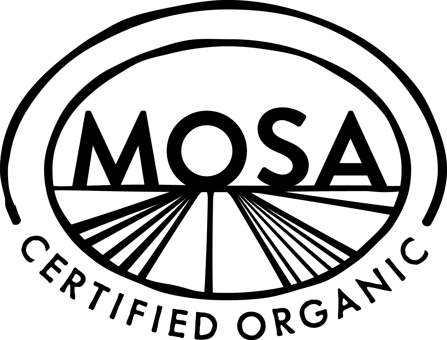
We review a lot of product labels for our clients. There is a huge diversity of designs, sizes and color schemes. To make it even easier to find a MOSA logo that works for you, we created additional designs that will give you the perfect option for your packaging and marketing needs. The first option is the standard black and white version if you don’t want to use a color logo.
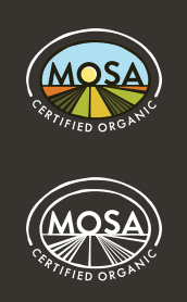
New to the lineup are “reversed” logos. Reversed logos are perfect for use on dark backgrounds. Now instead of using a grayscale version, you can use either a color logo with white lettering, or a completely white logo, both of which look amazing on dark backgrounds, which are common on label packaging.
Implementation
The official changeover date for our logo is when the new website goes live on January 12, 2017. From this point on, all new clients, and all new labels will need to use the new MOSA logo. We do recognize that many of you have labels in inventory. You are not required to update existing inventories until your next redesign. Both logos will be valid on existing packaging. When your labels come up for redesign and review, you will be asked to update the logo. We do not want to cause any unnecessary expense for any of our clients, so please call us if you have concerns or extenuating circumstances with updating the MOSA logo.
As many of you are probably aware, the FDA is requiring a new nutritional label format within the next two years. Manufacturers will need to use the new label by July 26, 2018. However, manufacturers with less than $10 million in annual food sales will have an additional year to comply. We will use the FDA compliance dates as the official final changeover to our new logo. This will allow you to minimize or avoid any additional expenses due to our logo change. For more details on the new FDA rule, visit the Changes to the Nutritional Facts Label page on their website. As always, we expect there to be some exceptions, so just give us a call.